Nilberg Wine Estate
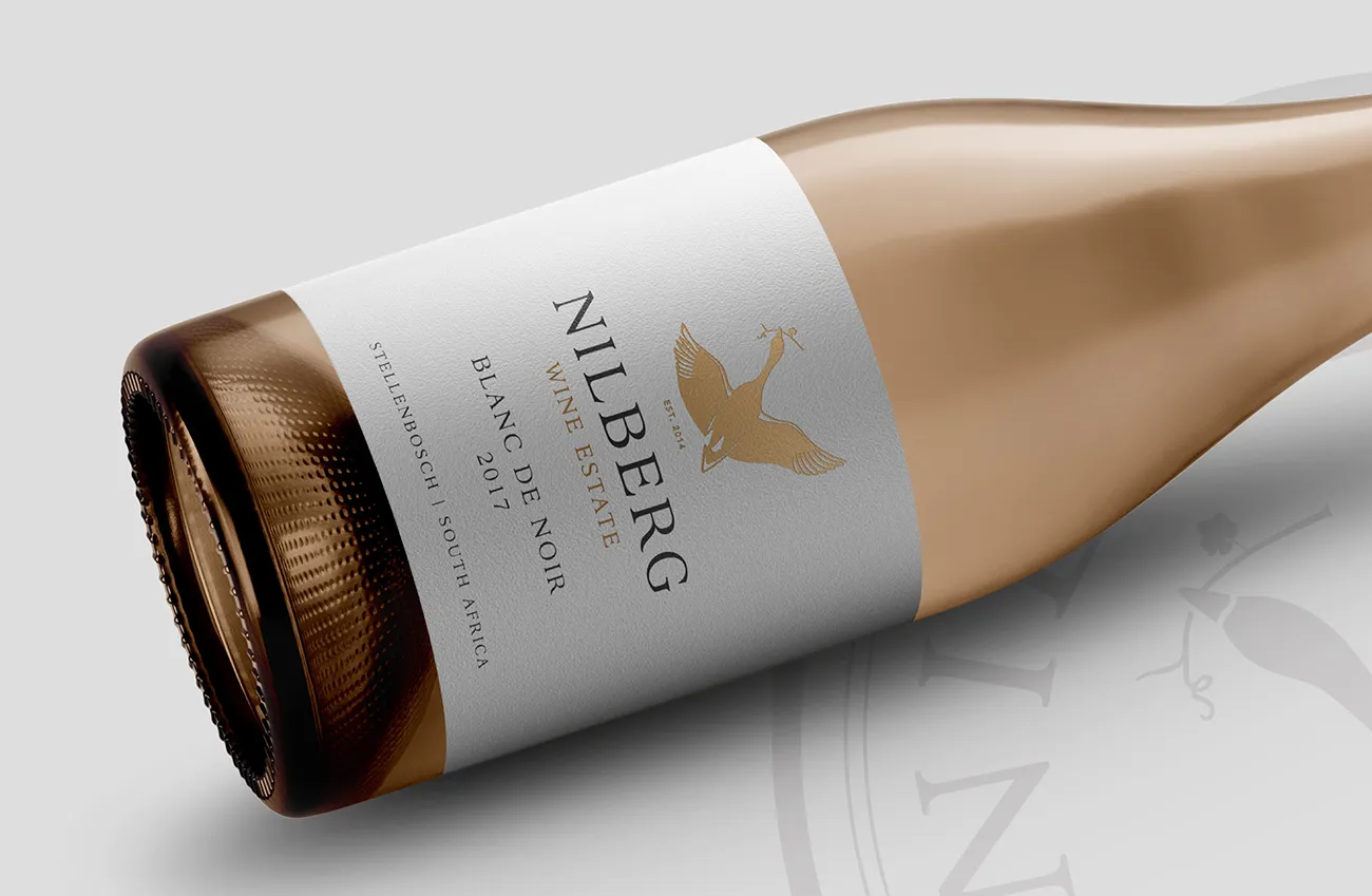
We welcomed the challenge to capture the history and essence of Nilberg Wine Estate in their new Corporate Identity and wine label design. Have a look at our design journey.
Client Brief
Our client approached us to design a logo and brand identity for their family wine farm in Stellenbosch. We received an open brief regarding colour, typography and imagery. The main focus for them was to capture the essense of the farm and its history. G2 welcomed the challenge.
Our Solution
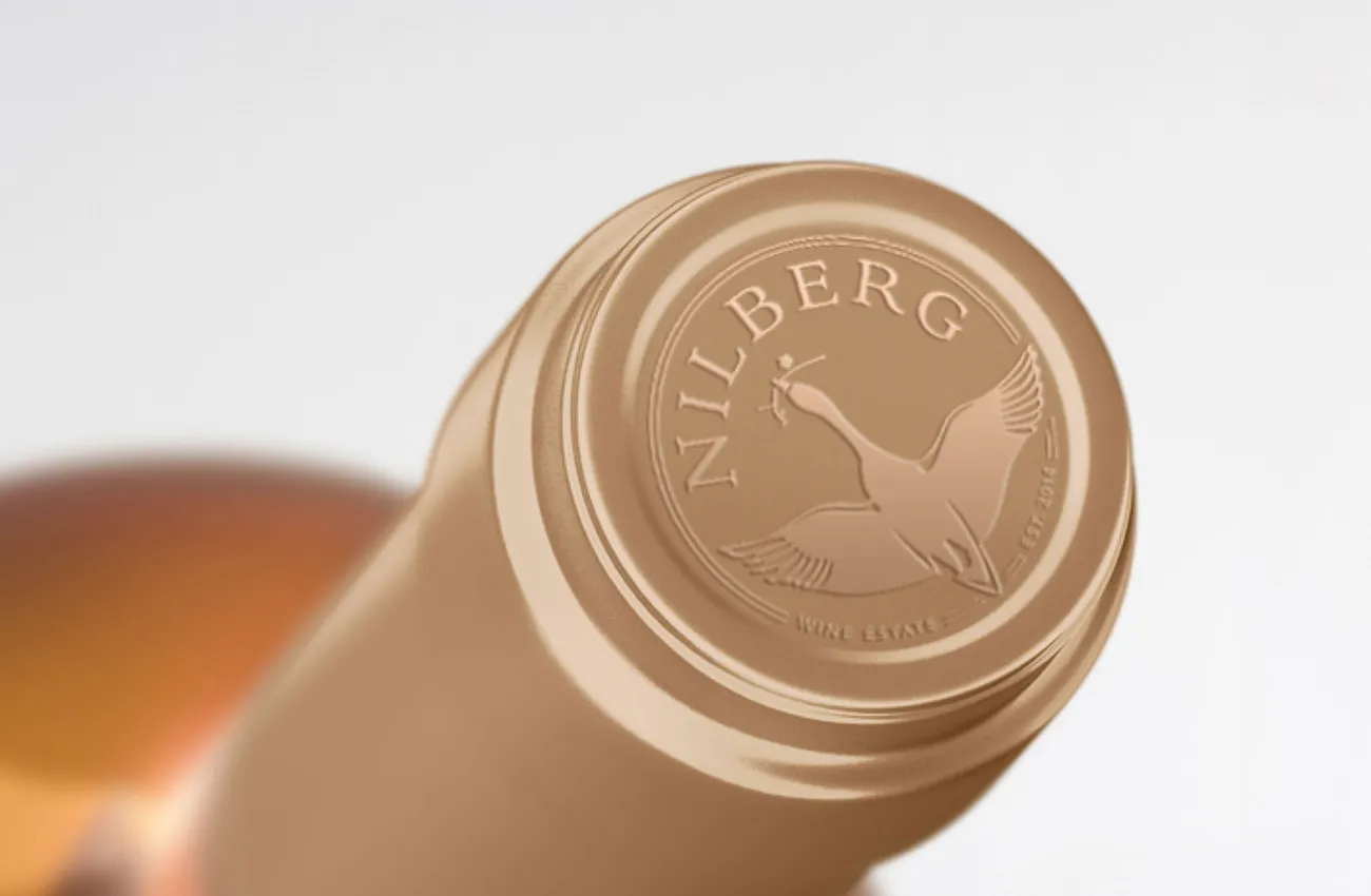
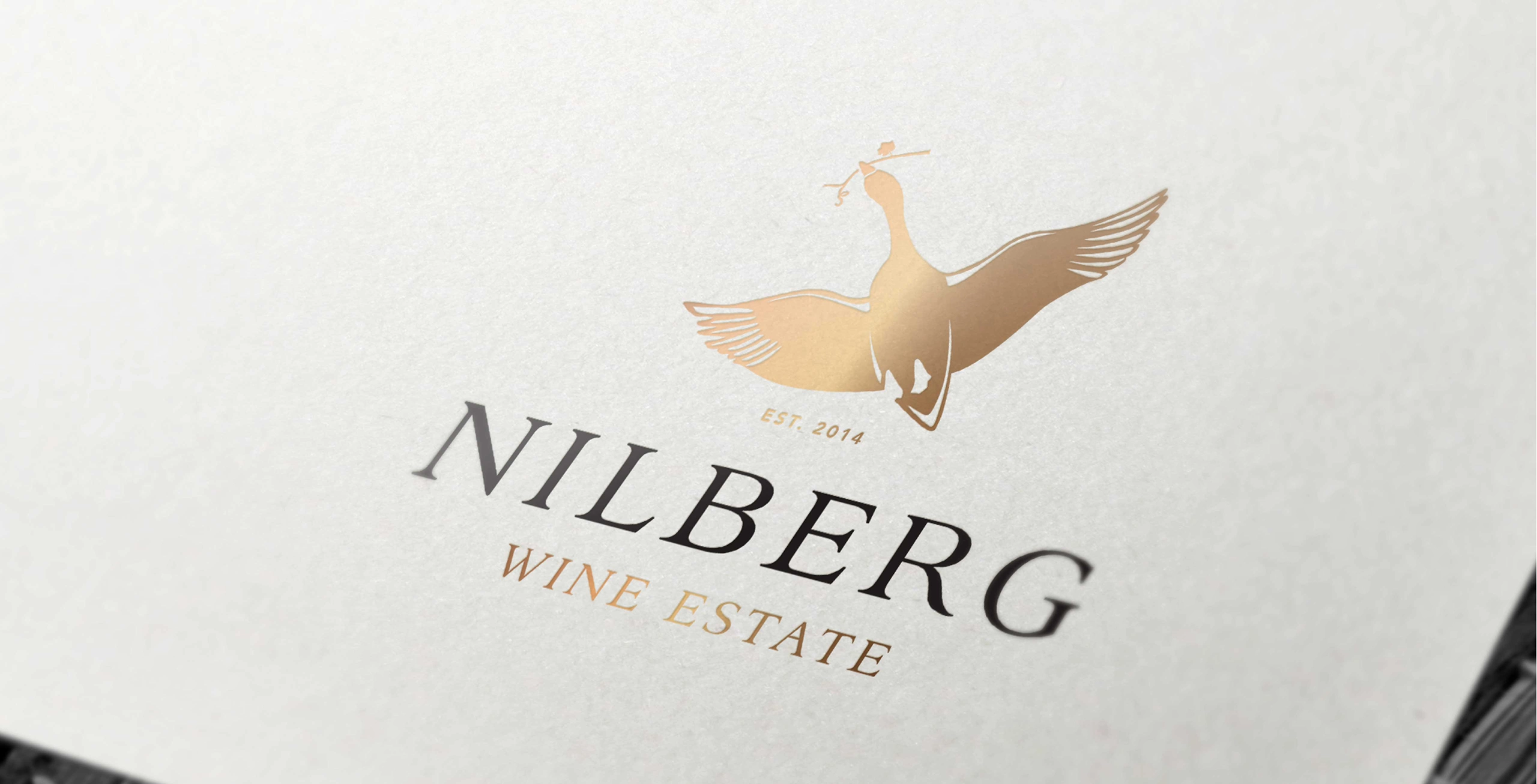
The team presented three options to the client. The first two options included patterns found in details of the farm house and cellar combined with the letter “N”. The third option was (as we call it) the wild card option. The client loved it. Nilberg (derived from the family name Nilsson) is originally from Swedish ancestry. We looked into the history of this name and came across the story of Nils Holgersson – The Wonderful Adventures of Nils by the Swedish author Selma Lagerlöf. The story of an elf, Nils, who joined wild geese on their journey across Sweden. This made the perfect connection between this Swedish family and their winery in South Africa. The logo consists of the a goose carring a vine branch in his beak – metaphorically bringing the Swedish heritage to this South African winery.