Orbit Integral
Orbit Integral is logistics company who needed a new logo. The overall concept of this logo captures the meaning of “orbit”. Have a look at our design team\\
Our Challenge
One of our clients, Zestfruit, approached G2 to assist them in designing a range of new logos for them. Orbit Integral is a logistics company that focuses on loading slots, transit times, offloading slots, warehouse intakes, as well as track, trace visibility and manage the cost for their clients. The name “Orbit” is a perfect fit for this company - referring to the curved path of a celestial object like the moon.
Our Solution
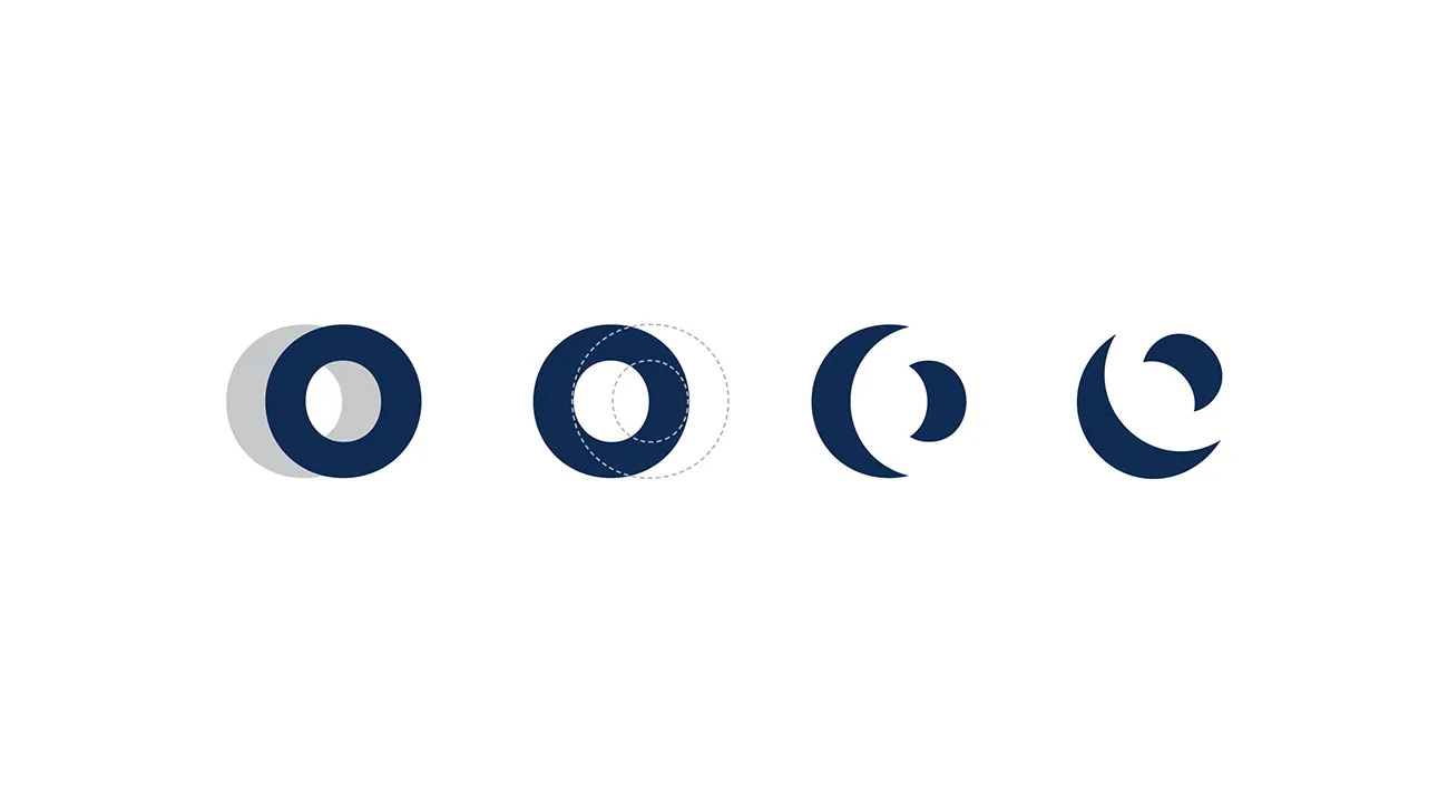
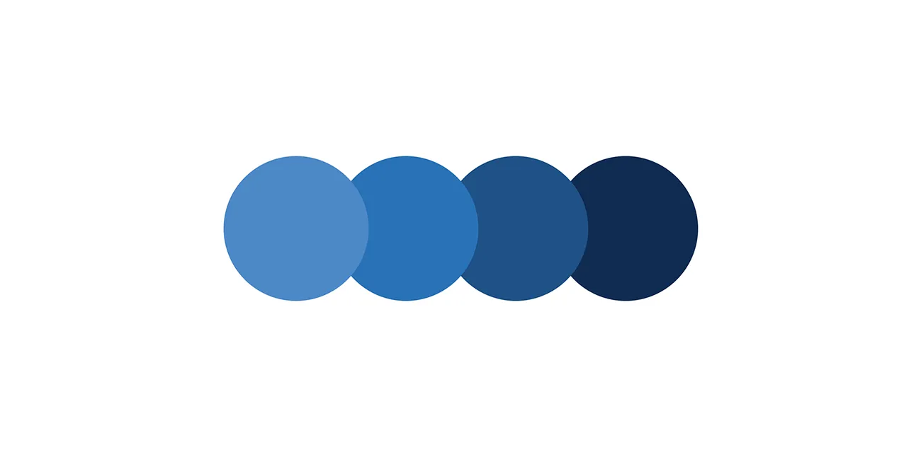
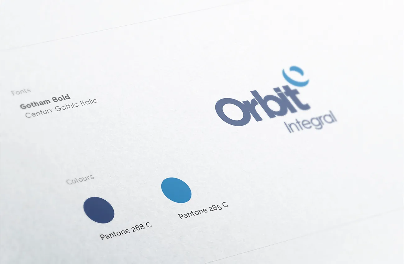
The overall concept of this logo captures the meaning of “orbit”. Our design team loved the significance of the name and started playing around with circular shapes. Sometimes great design happens “by mistake” while exploring designs. In this case the icon was discovered while combining two “o’s” that symbolises the curved path. We looked at the negative space when these two shapes are placed together. The end result represents two curved objects revolving around one another also looking like the moon. The clean and simple characteristics of the lettering and placement of it enhances the balance of negative spaces in the icon. This gives the logo a complete look. Movement is created by including slanted lettering. A range of corporate blues are selected for this logo to create a confident and trustworthy look.