Blaauwklippen
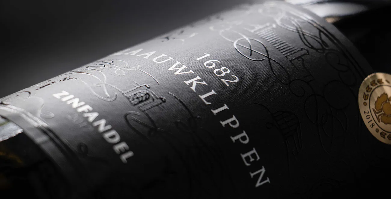
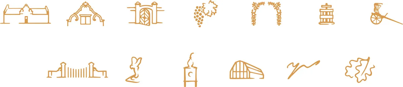
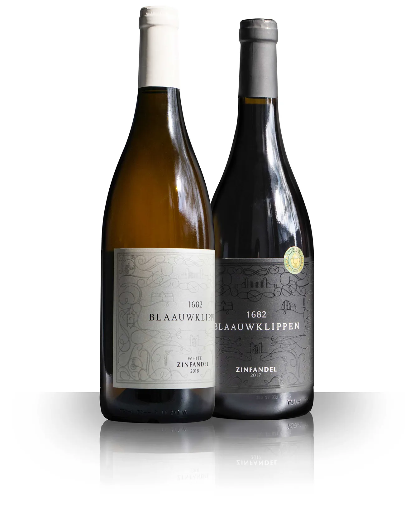
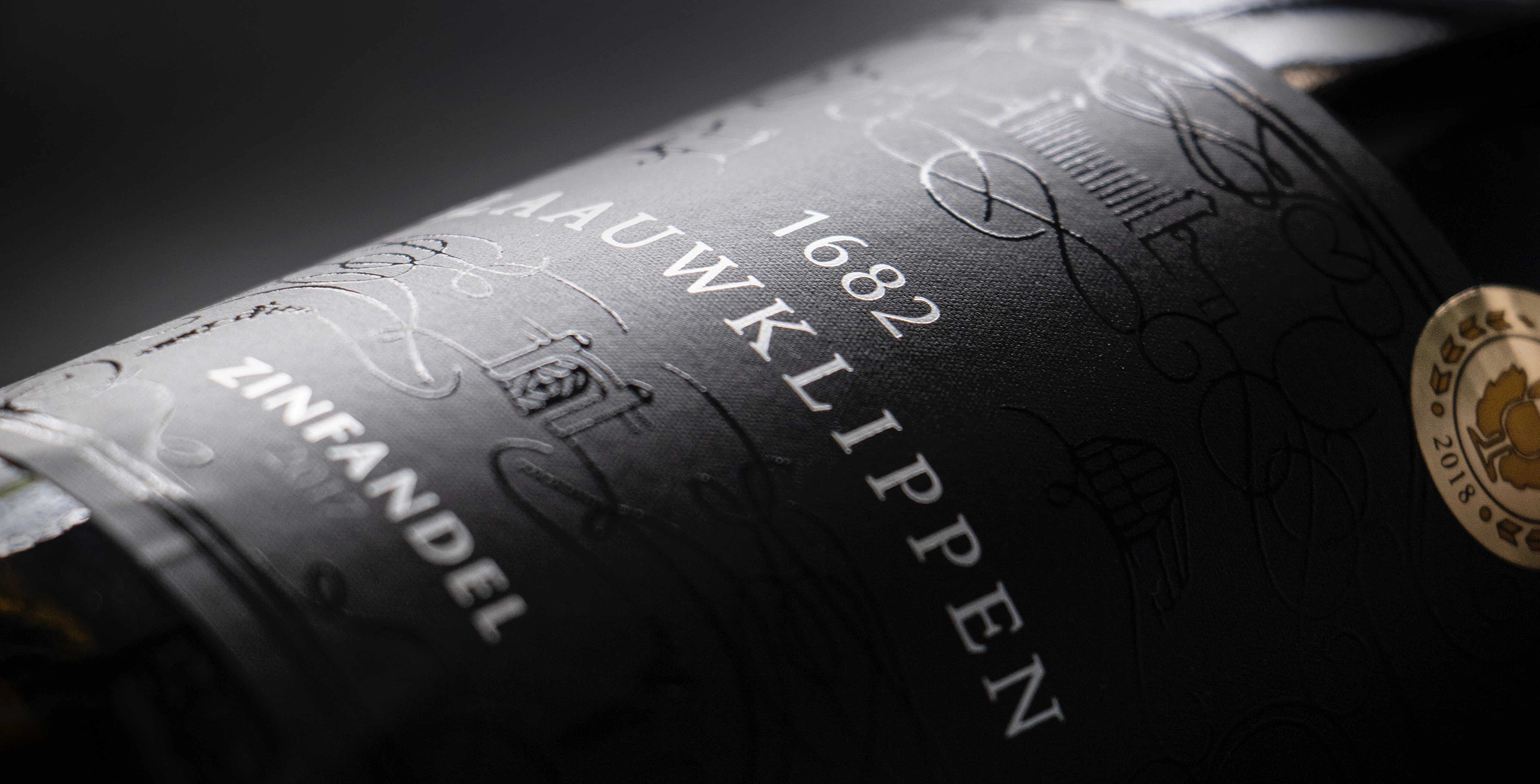
G2 developed a bespoke iconography system for Blaauwklippen and integrated it into a refined wine label design, balancing subtle detail with print-ready simplicity and a hand-drawn character.
Client Brief
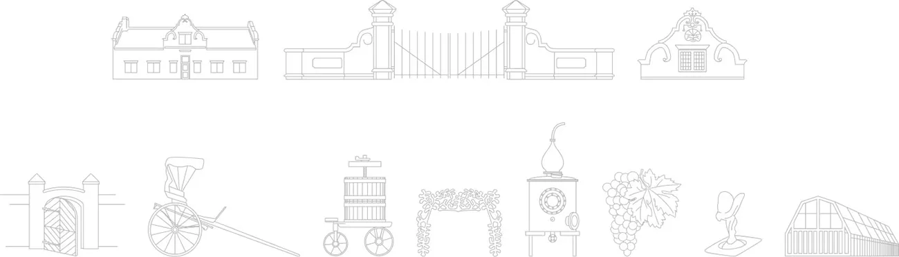
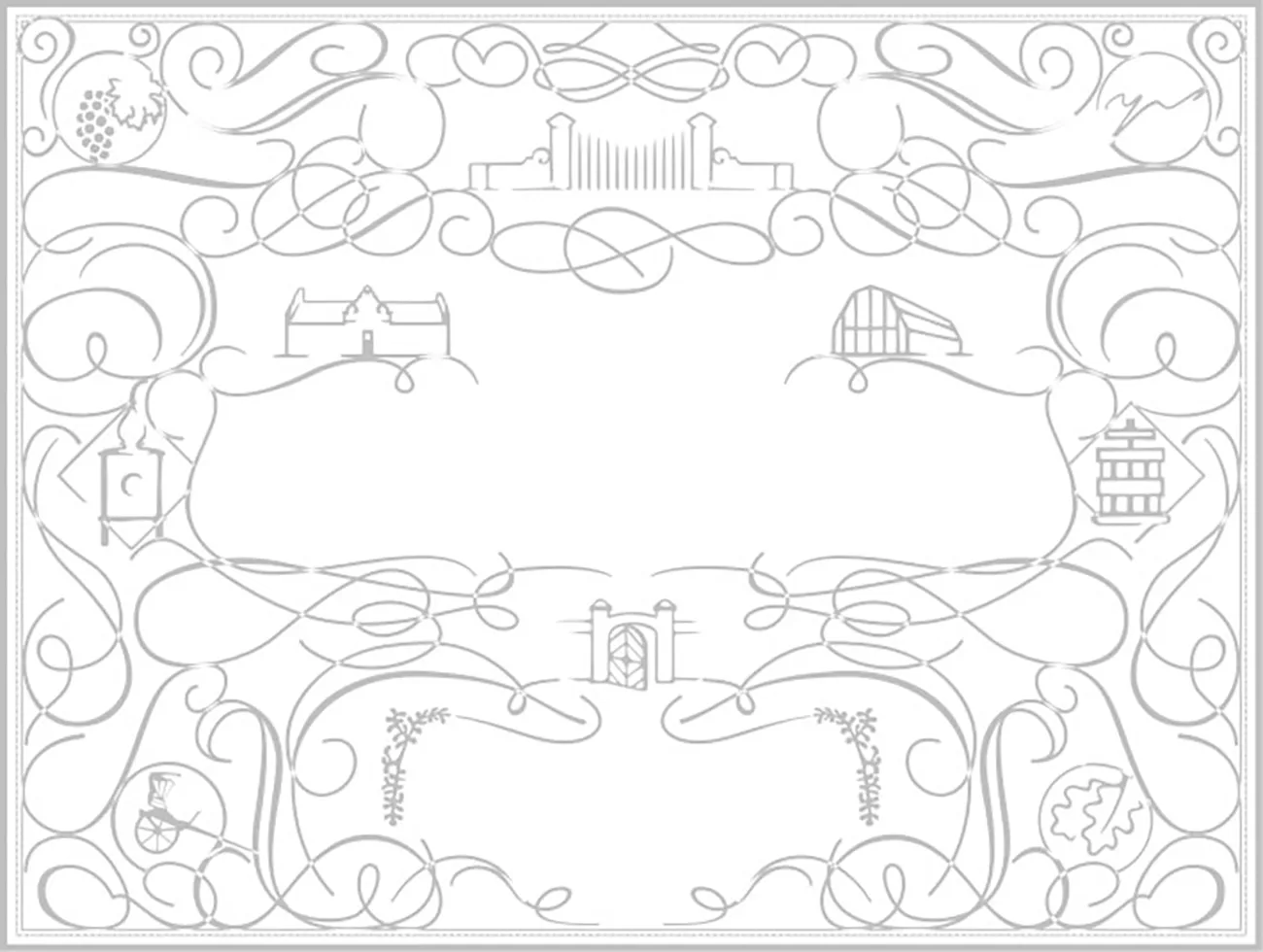
G2 was briefed by the client to develop a set of iconography based on various elements found around the Blaauwklippen Estate. This needed to then be incorporated into the label as subtle supporting elements.
Our Solution
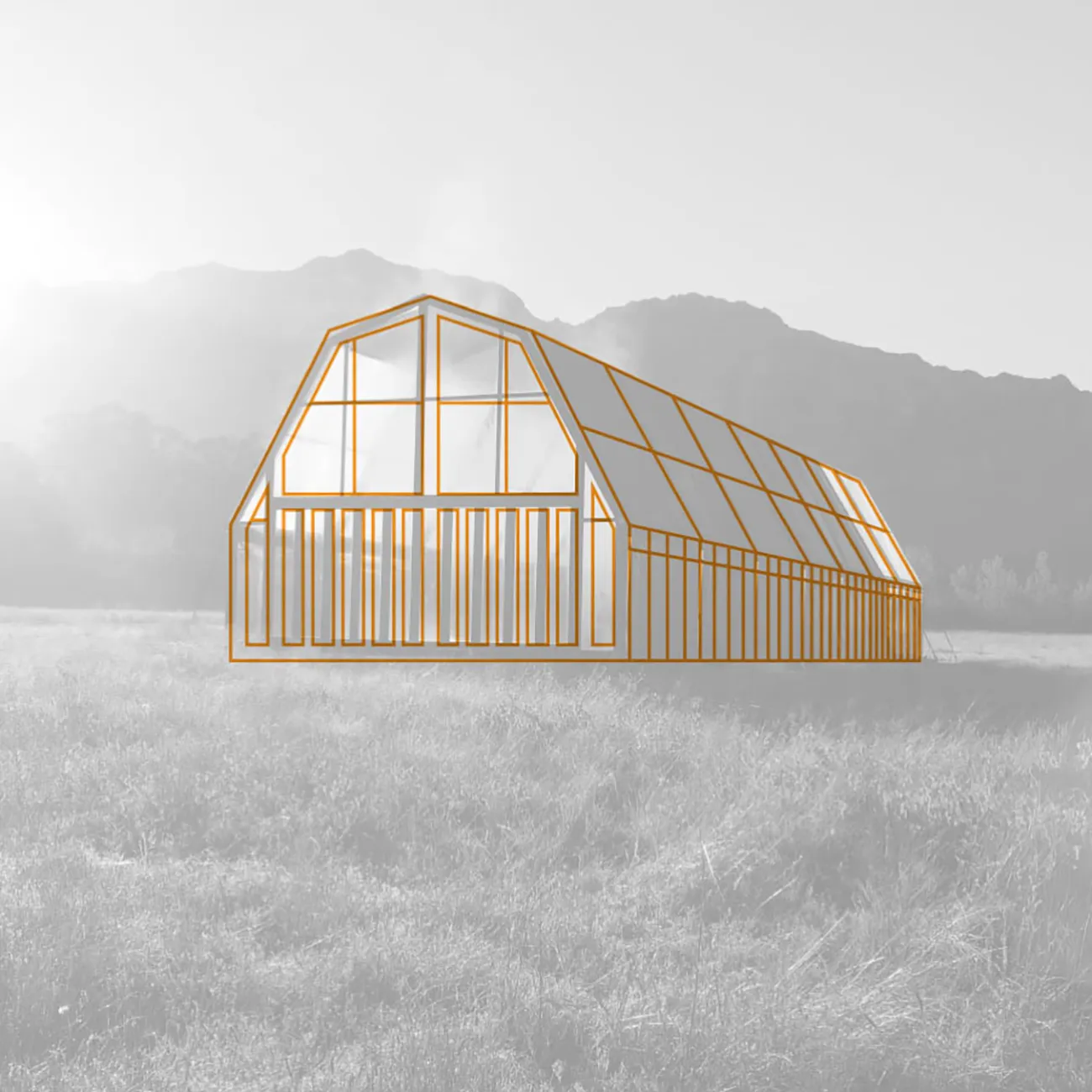
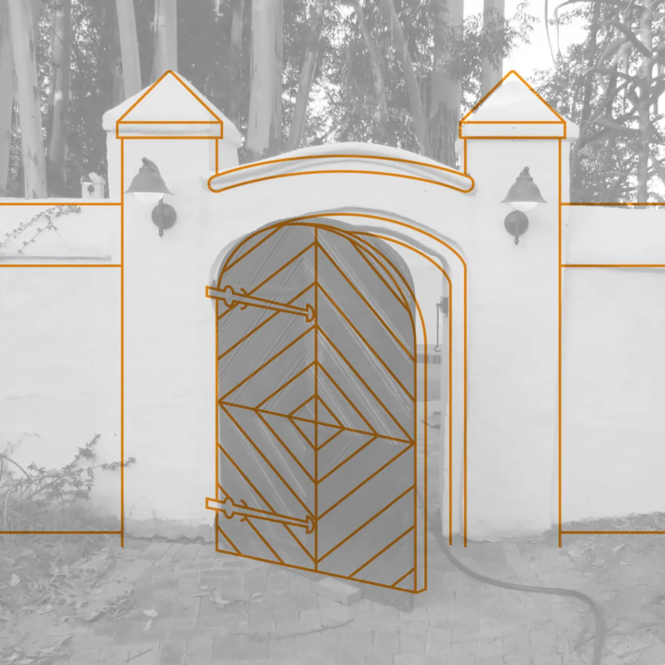
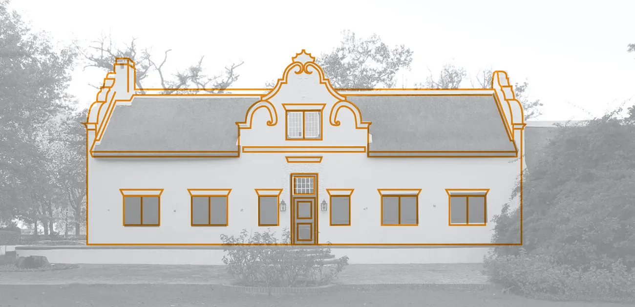
We started off by visiting the estate and photographing the various elements the client wanted to be depicted.
This was then redrawn to create simplified line drawings of the elements.
Deliverables
- Wine label and packaging design
- Custom iconography set based on estate elements
- Illustration refinement for print legibility
- Label composition with filigree supporting elements
- Print-ready artwork supply